04
Northwind
Packaging that says almost nothing, for a company whose product does the talking.
- Client
- Northwind Supply
- Year
- 2024
- Role
- Packaging and identity
- Deliverables
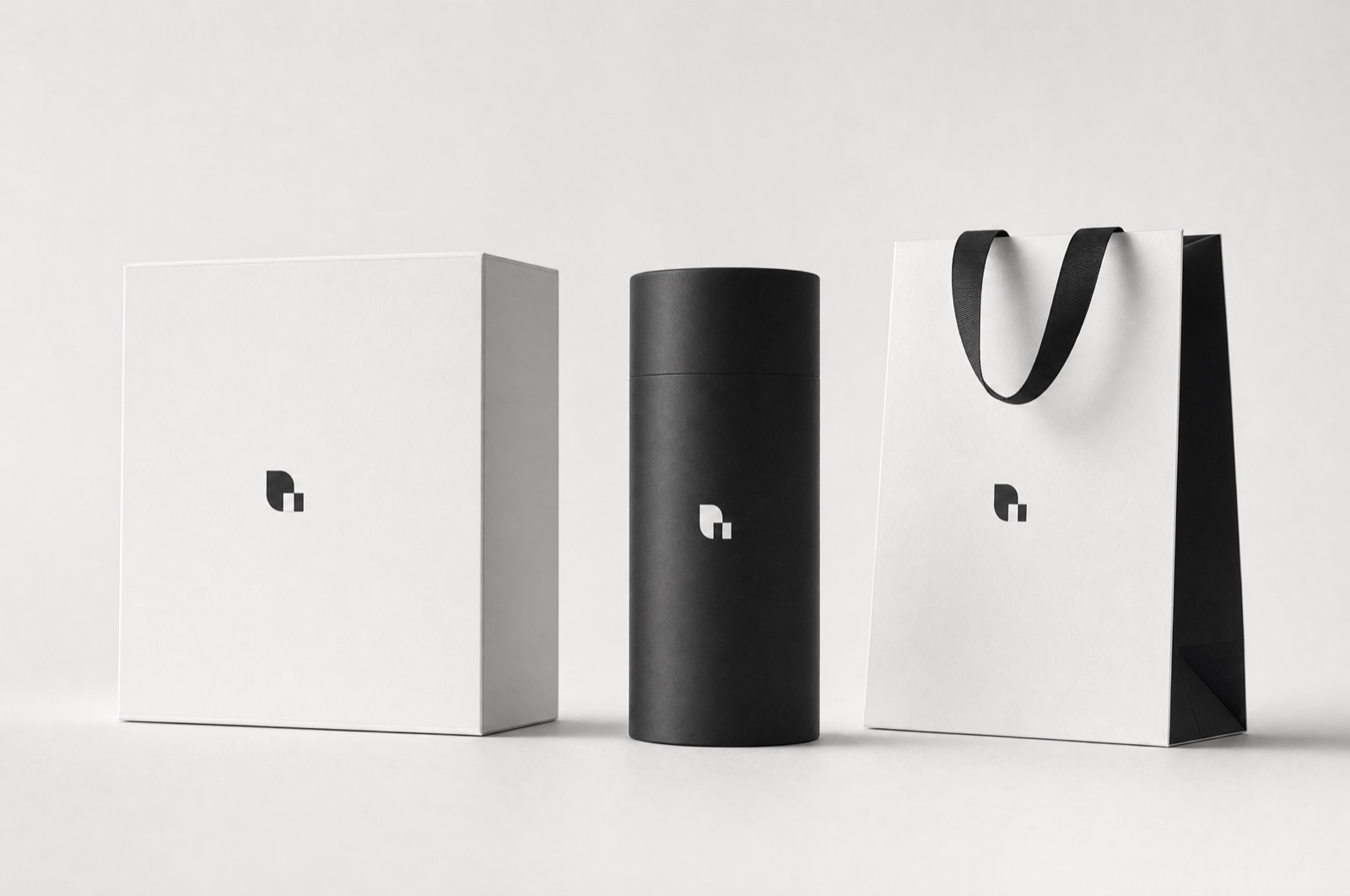
- Box, tube, carrier, print specification
Packaging
Northwind sell tools. Good ones, expensive, to people who already know what they are buying — which means the packaging does not have to sell anything. It has to not undermine the object inside.
Subtraction as strategy
The category default is a photograph of the product, a list of features, and three certification badges. We removed all of it. What remains is the mark, blind-debossed, and the product name set once at the size of a serial number.
The argument for this is commercial rather than aesthetic: a customer who has already decided does not need persuading at the moment of unboxing, and being sold to at that moment is faintly insulting.
The specification is the design
Most of the effect comes from decisions that never appear in a rendering — an uncoated board with enough bulk to feel like a single piece, a deboss deep enough to catch light at a low angle, and no lamination anywhere, so the box ages rather than scuffs.
Result
Unboxing videos, unprompted, which for a company that had never spent anything on marketing was the entire return.